Attracting Customers in Niagara Falls with Paint
Walk into any successful retail store, restaurant, or office lobby in Niagara Falls and you will notice something immediately. The space just feels right. The lighting is good, the layout makes sense, and somehow you feel welcome, energized, or at ease before anyone has even said hello.
In most cases, that feeling starts with paint.
Color is one of the most powerful and underused tools in commercial design. Research shows that consumers subconsciously judge a retail environment based on its color within the first 90 seconds of viewing a space, with somewhere between 62% and 90% of that snap judgment driven by color alone.
For business owners in Niagara Falls, a city that attracts millions of tourists every year alongside a thriving local economy, the right paint color is not just a decorating choice. It is a business strategy.
At Tresham Painting, we have spent over two decades helping Niagara Region businesses transform their commercial spaces with purpose-driven color. Here is everything you need to know about color psychology and how to use it to attract more customers through your door.
What Does Color Psychology Have To Do With Business?
Color psychology is the study of how hues affect human emotion, mood, and behavior. In a commercial setting, this translates directly to how long customers stay, how much they spend, how comfortable they feel, and whether they come back.
Strategic color selection has been shown to increase customer dwell time by 20 to 30%, improve employee productivity by 12 to 15%, and strengthen brand recognition by up to 80%. These are not small numbers. They represent real dollars and cents for businesses competing in a busy, tourism-driven market like Niagara Falls.
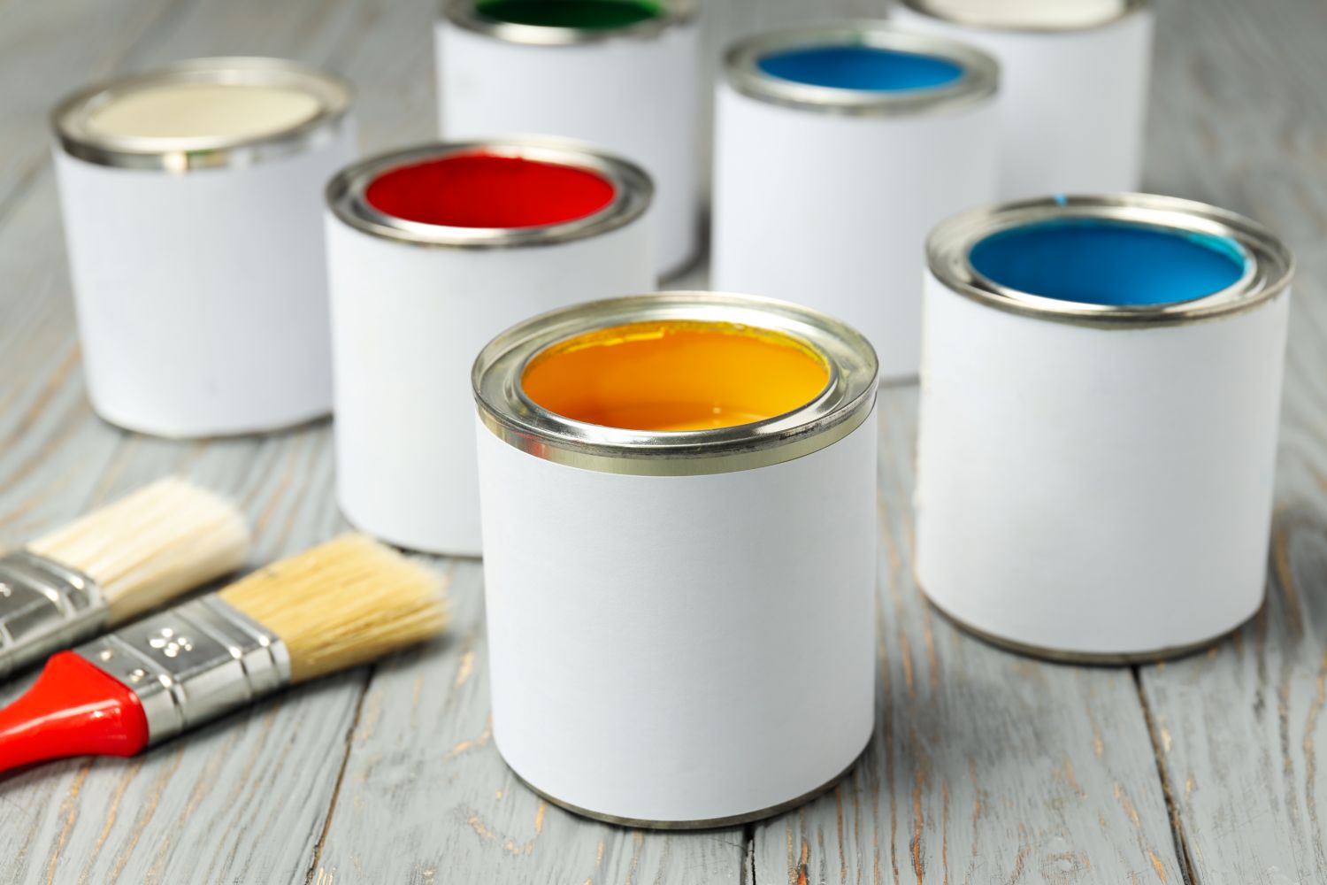
The psychology behind color is not random. Each hue triggers specific neurological and emotional responses.
Warm colors raise energy and appetite.
Cool colors promote calm and trust.
Neutral tones convey sophistication and flexibility.
When you understand these responses, you can design your commercial space to guide how customers feel from the moment they step inside.
Through the Palette Mood by Mood
Before jumping into full color schemes, it helps to understand what individual colors signal to your customers.
Blue
Blue is the color of trust, reliability, and calm. It is one of the most universally used colors in professional environments because it promotes focus and conveys competence. Lighter blues create a soothing, open atmosphere, while deeper navy tones add authority and sophistication.
Blue works especially well in:
- Corporate offices and professional service firms
- Banks, law offices, and financial advisors
- Healthcare and wellness clinics
- Hotel lobbies and reception areas
Green
Green signals health, balance, and nature. It reduces eye strain, promotes relaxation, and aligns beautifully with any brand positioning around sustainability, wellness, or the outdoors. For a city like Niagara Falls, which is naturally associated with lush landscapes and the environment, green is a powerful local fit.
Green works well in:
- Spas, yoga studios, and wellness centers
- Organic cafes and health food stores
- Eco-tourism offices and nature-based businesses
- Hotel and resort spaces that want a nature-inspired feel
Red
Red is bold, urgent, and stimulating. It raises heart rate and stimulates appetite, which is why so many of the world’s most recognizable fast-food chains have used it for decades. In a retail context, red communicates urgency and can drive impulse purchases. However, too much red becomes overwhelming, so it is best deployed as an accent color rather than an all-over wall treatment.
Red is effective in:
- Restaurants and cafes
- Fitness centers and gyms
- Retail sale and clearance areas
- Accent walls and feature signage
Yellow
Yellow is the color of optimism, energy, and warmth. It grabs attention quickly and creates a bright, cheerful environment. Used strategically, yellow can make a space feel more inviting and emotionally uplifting. It performs best in moderation, as an accent or feature wall, rather than in large doses.
Yellow suits:
- Breakfast diners and family-friendly restaurants
- Creative agencies and co-working spaces
- Retail boutiques targeting a youthful demographic
- Tourism-focused businesses looking for a high-energy feel
Neutral Tones: Beige, Taupe, Gray, Off-White
Neutral colors never go out of style in commercial settings. Warm beige, soft taupe, and greige tones create versatile, timeless backdrops that let your products, branding, and decor do the talking. In 2025, neutrals are trending with an earthy, textured feel, think clay-inspired walls, warm sandstone, and creamy whites.
Neutrals work beautifully in:
- Upscale retail stores and boutiques
- Professional office environments
- Hotel rooms and suites
- Real estate offices and showrooms
Purple
Purple blends red’s energy with blue’s calm, creating a distinctive emotional balance that many businesses overlook. It has strong associations with luxury, creativity, and royalty. Deep plum and violet work well as accent colors in high-end retail or spa environments, while softer lavender promotes calm in wellness settings.
Purple works well in:
- High-end retail boutiques and jewelry stores looking to communicate exclusivity
- Spas, meditation studios, and holistic wellness centers
- Hair salons and beauty studios where creativity and transformation are central to the brand
- Upscale wine bars and cocktail lounges seeking a rich, moody atmosphere
- Creative agencies and design studios where innovation is a core brand value
Tailoring Color to Your Industry in Niagara Falls
Niagara Falls is a unique market.
You have a massive hospitality and tourism sector serving millions of visitors per year, alongside a growing permanent community of residents who support retail, professional services, and local dining. Color strategy should reflect both your industry and your audience.
Retail Stores
Retail is all about creating an experience that keeps customers browsing longer and buying more.
Warm, earthy tones like olive green, rust orange, and warm taupe are trending in boutique retail environments right now, creating cozy and inviting atmospheres. High-contrast palettes such as black and white, or navy and gold, communicate luxury and sophistication. For retailers near the tourist corridor, a bold and vibrant accent color tied to your brand identity can help you stand out in a visually competitive environment.
Recommended color scheme for Niagara Falls retail:
- Warm white or soft greige as a base
- Deep teal or forest green accent wall
- Natural wood tones in fixtures for warmth
- Gold or brass accents for a premium touch
Restaurants, Cafes, and Food Service
In Niagara Falls, restaurant owners are catering to tourists looking for a memorable dining experience and to locals who want a neighborhood feel. The right color palette can communicate both.
Earthy, warm tones like terracotta, amber, and burnished orange create a cozy, appetite-stimulating environment. For upscale dining, deep jewel tones like burgundy, forest green, or navy paired with warm lighting and rich neutrals communicate a premium experience.
Recommended color scheme for Niagara Falls restaurants:
- Warm terracotta or brick red as a feature color
- Cream or warm white on secondary walls
- Deep olive green or charcoal for trim and accents
- Soft, warm lighting to complement the palette
Hotels, Resorts, and Hospitality Venues
Tourism is the heartbeat of Niagara Falls, and hospitality businesses need to create spaces that feel both welcoming and memorable.
Soft golds, warm greens, and neutral tones work exceptionally well in hotel lobbies and common areas. Guest rooms benefit from calming palettes that promote rest, think soft blue-grays, muted sage greens, and warm creamy whites. For event spaces and banquet halls, more dramatic palettes featuring navy, deep burgundy, or rich charcoal can create the sense of occasion that guests are looking for.
Recommended color scheme for Niagara Falls hospitality:
- Soft aqua or mist blue in lobby areas to echo the Falls
- Warm taupe or sand in guest rooms and suites
- Deep navy or charcoal in event and dining spaces
- Gold or bronze accents throughout for a polished finish
Offices and Professional Services
Professional service businesses in Niagara Falls, including law firms, real estate offices, financial advisors, and medical practices, benefit from palettes that communicate trust, competence, and calm.
Blues and greens are the dominant choices here, along with sophisticated neutrals. Avoid high-energy warm colors in spaces where clients need to feel safe, focused, and confident.
Recommended color scheme for Niagara Falls offices:
- Medium blue or slate in reception and meeting rooms
- Soft gray or warm white in private offices
- A single accent wall in deep navy or forest green for visual interest
- Clean white ceilings and trim to keep the space feeling open and professional
Before You Pick Up the Paint
Before committing to a color scheme, keep these principles in mind:
- Consider your brand colors first. Your interior palette should be consistent with your logo, signage, and marketing materials to reinforce brand identity across every customer touchpoint.
- Think about natural light. Niagara’s seasonal light changes significantly from summer to winter. Test paint samples at different times of day before making a final decision.
- Use the 60-30-10 rule. Sixty percent of your space in a dominant neutral, 30% in a secondary color, and 10% in an accent creates a balanced and professional result.
- Choose the right finish. High-traffic commercial spaces benefit from satin or semi-gloss finishes that are easy to clean and hold up over time.
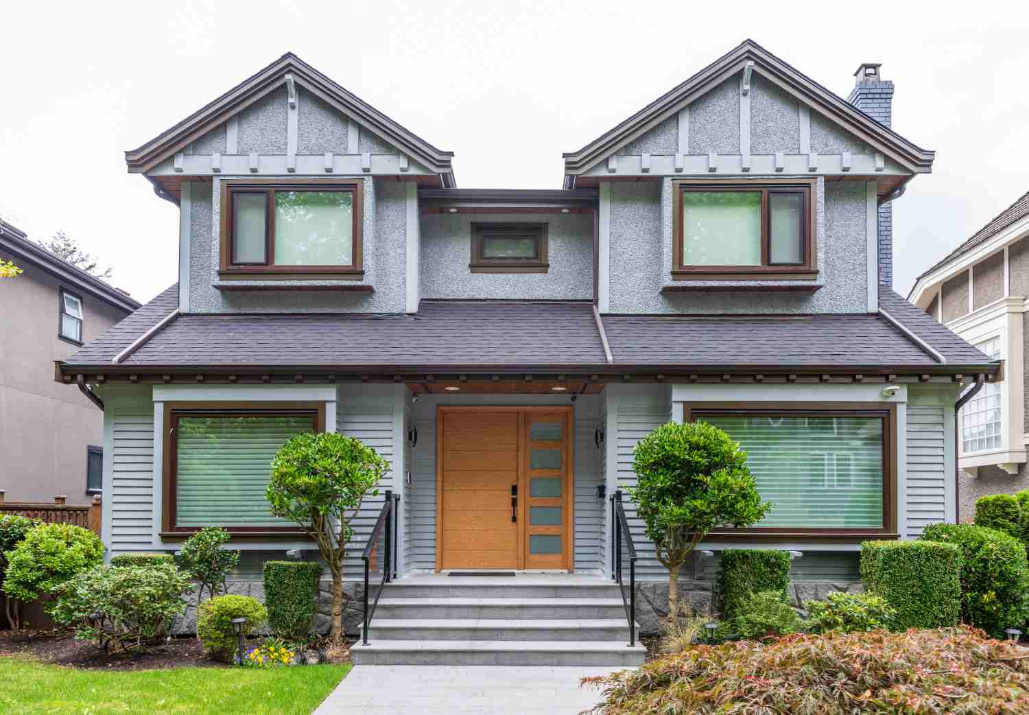
- Do not overlook the exterior. Your building’s exterior is the first impression customers get. Bold, well-chosen exterior colors can drive foot traffic even before someone walks through the door.
Ready to Transform Your Commercial Space?
Color is one of the most cost-effective investments a Niagara Falls business can make. A professional paint job with a strategically chosen palette can refresh your brand identity, improve customer experience, and set your business apart from the competition, all without a major renovation.
At Tresham Painting, our team offers color consultation services alongside full commercial interior and exterior painting for businesses across the Niagara Region. We work around your schedule to minimize disruption, and every project is backed by our 2-year workmanship warranty.
Contact Tresham Painting today or visit treshampainting.ca to book your free, no-obligation quote. Let us help you create a space that works as hard as you do.